
A visual identity for Usine Kugler, an artists’ community in a former industrial building in Geneva. The factory’s brick chimney provides the starting point for a system connecting logotypes, a monogram, a bespoke typeface and signage.
The site hosted Geneva’s Fine Arts school in 1998. After a long campaign supported by Asloca, the Federation of Kugler Artists (FAK) regained its workshops in 2005. That sense of shared place and belonging informs the identity.
My role: I developed the identity independently, from concept and logotypes to the monogram, bespoke typeface, signage design and brand guidelines. Signage production was carried out with external support.
The concept
The large 19th-century brick chimney at the centre of the factory suggested the identity’s basic unit: the brick. Its shape shares structural features with the lettering, bringing symbol and type into a coherent visual language.

The brick
Logotypes

Primary logotype
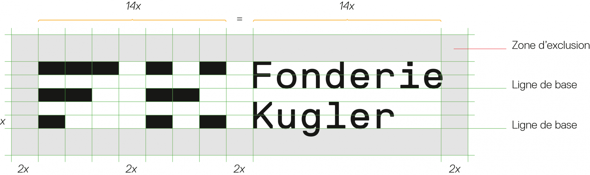
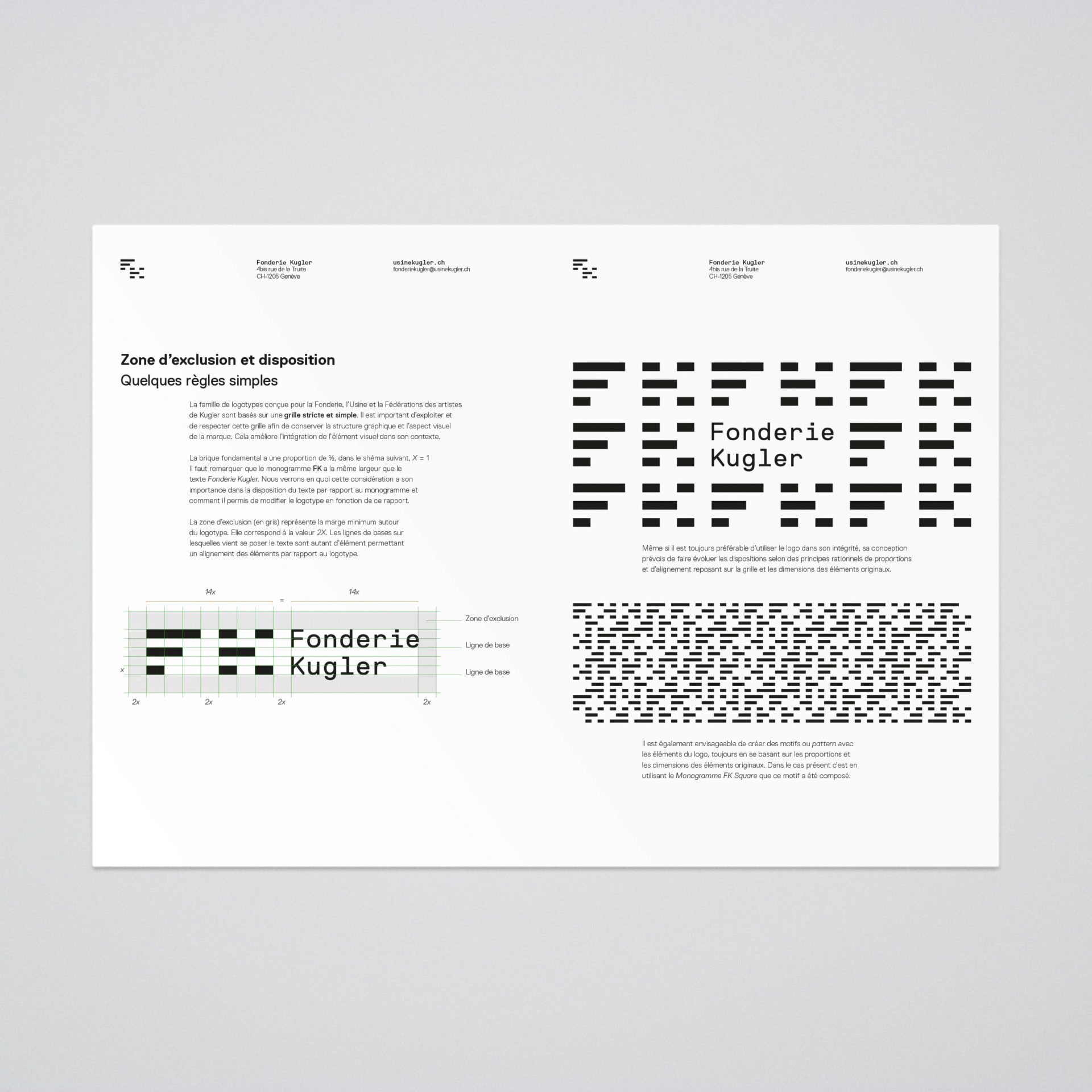
Spacing

The typeface and monogram share a grid. This common structure allows the identity to extend into patterns and compositions while retaining a recognisable relationship between its elements.

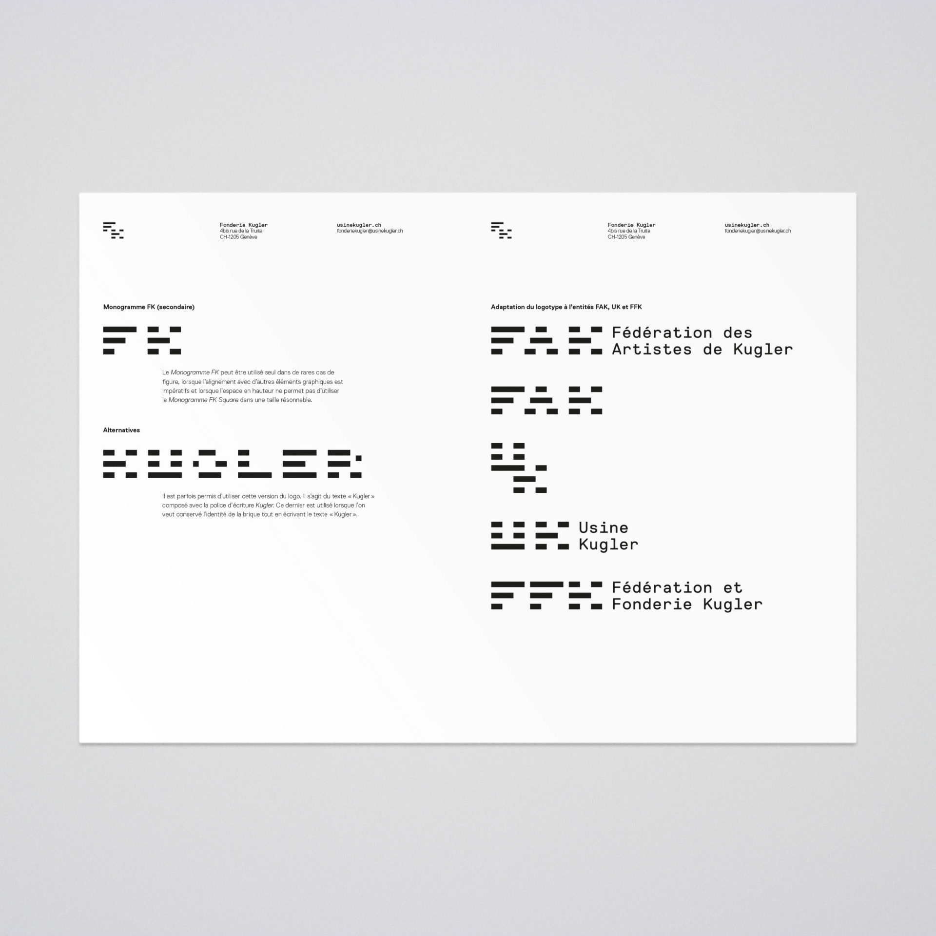
The monogram
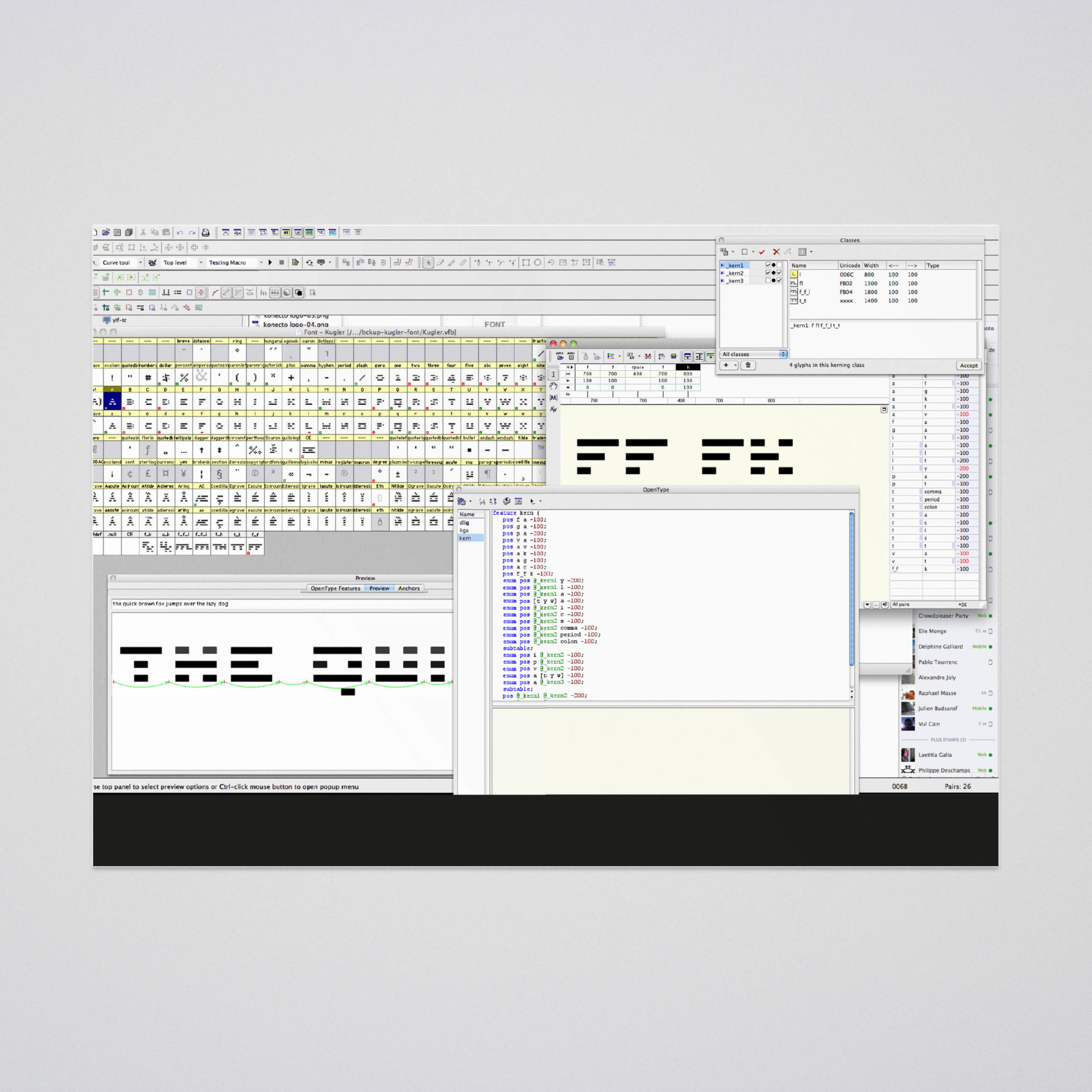
Typeface
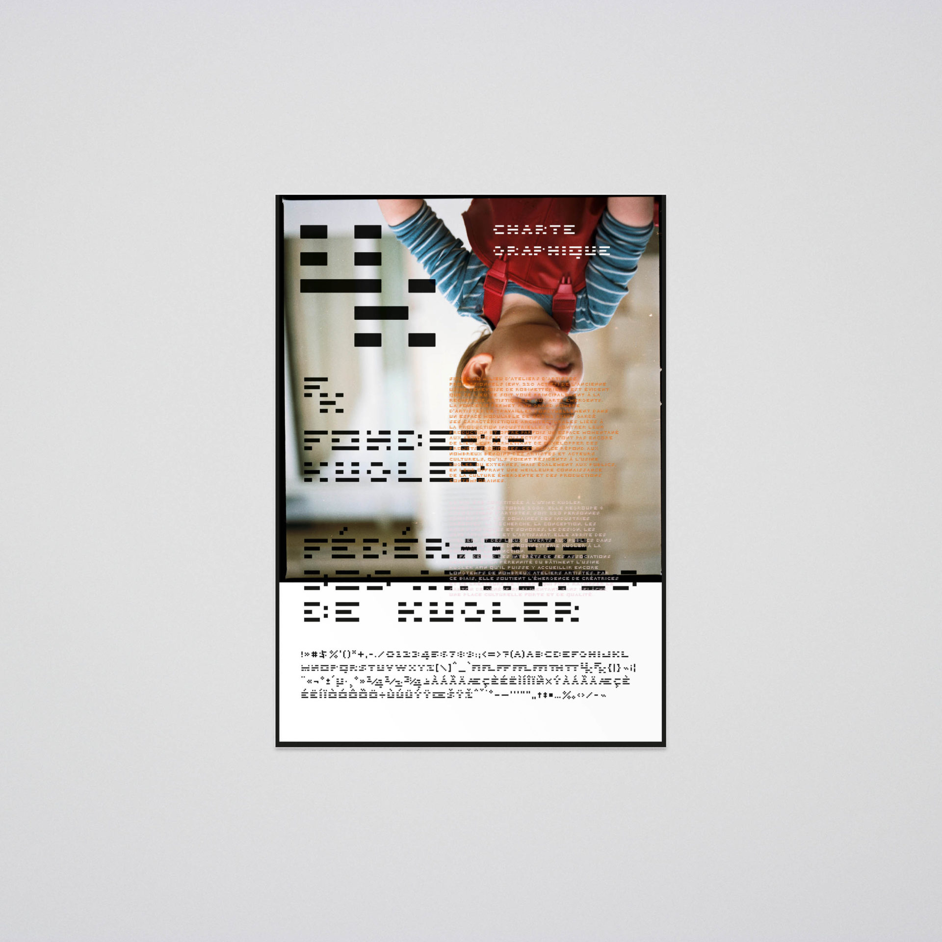
A bespoke typeface extends the monogram’s forms into lettering for posters, flyers and digital communication. It gives the identity a reusable design tool beyond the logotype.

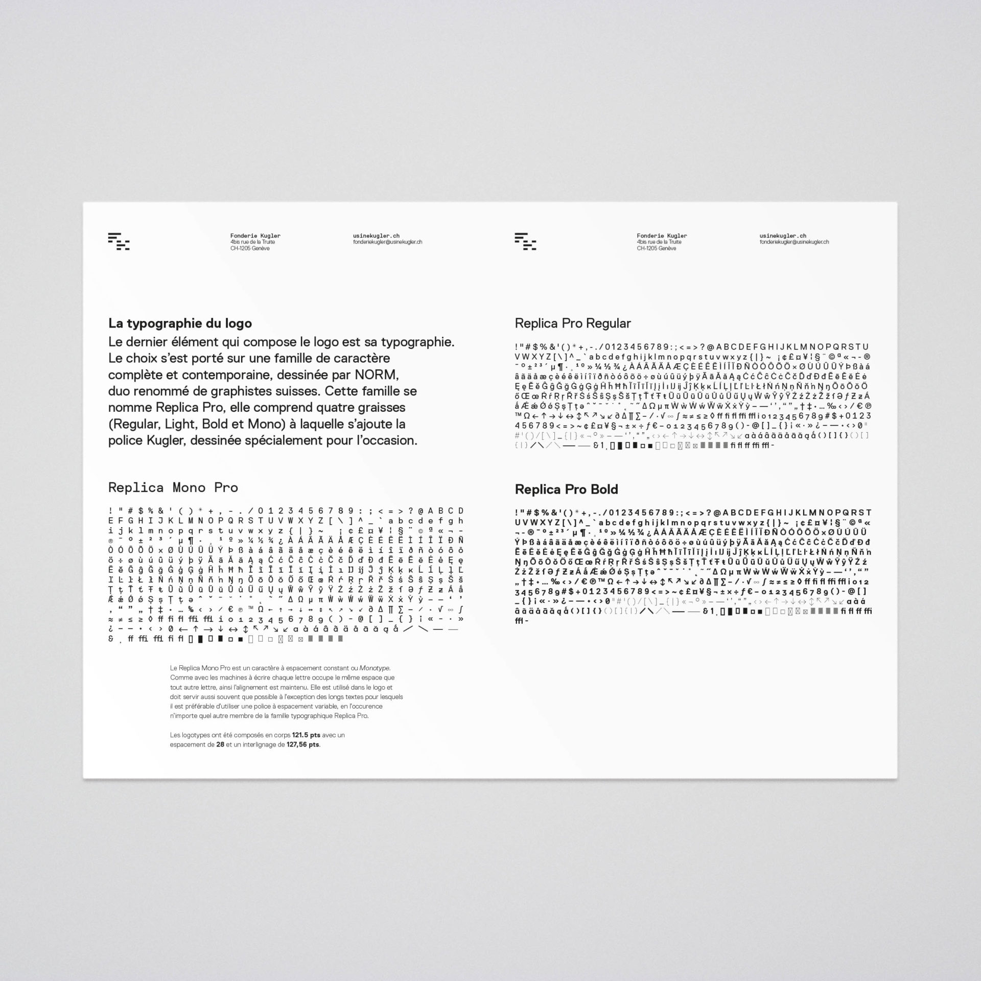
Character map

Signage

Signage




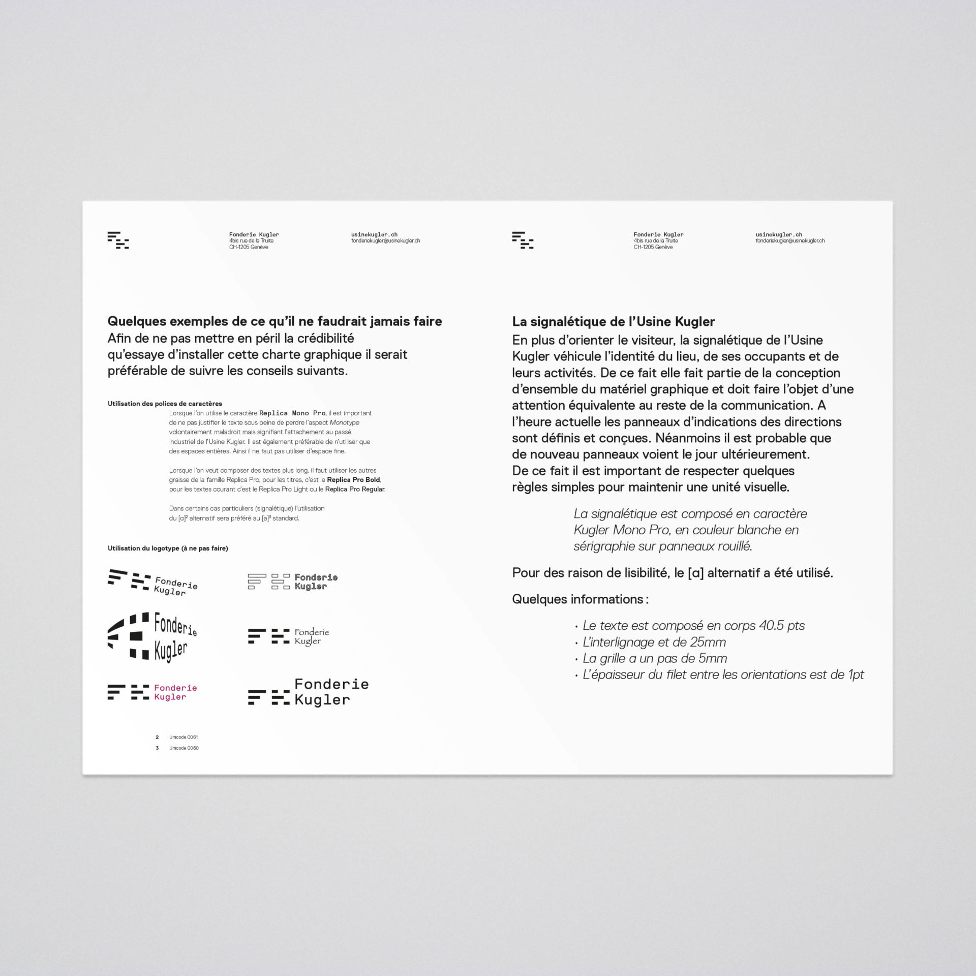


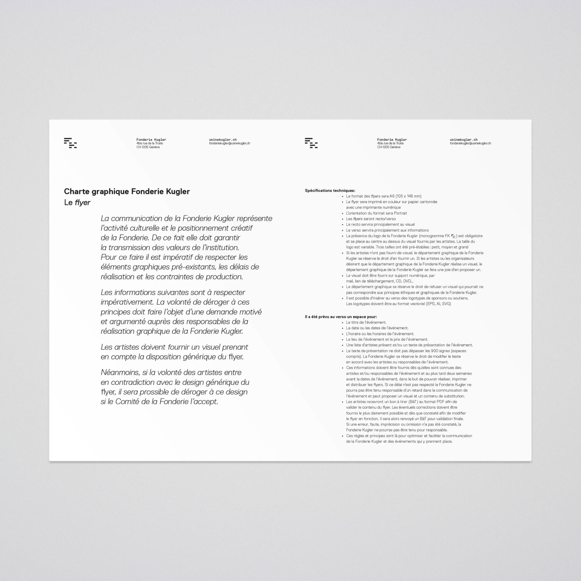
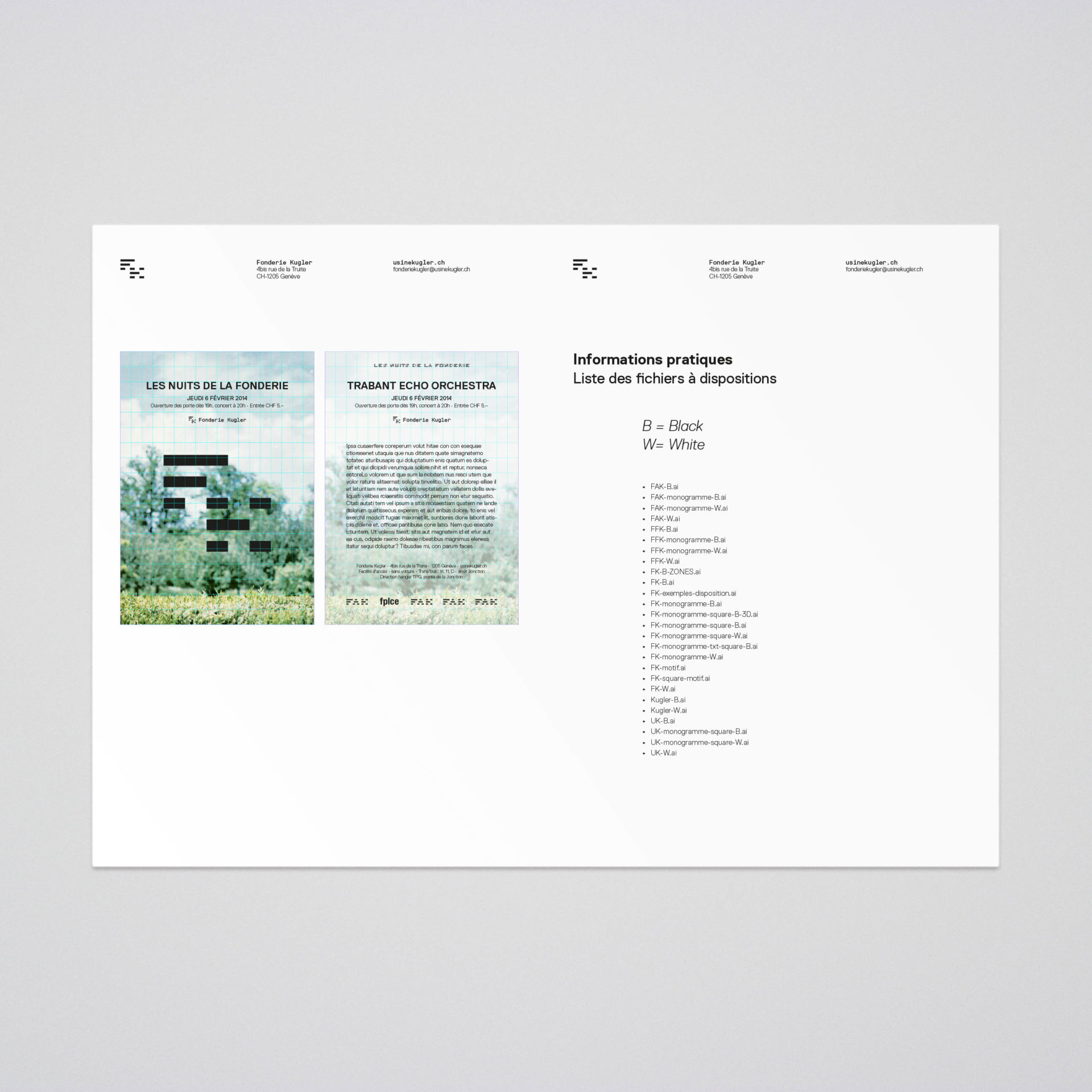

Guidelines