Located in a former fittings company, the Kugler art factory hosted the Fine Arts school of Geneva (back in 1998), but the road was long and perilous before allowing the Federation of Kugler artists (FAK) to settle in for good. After a long fight with Asloca by their side, the artists finally regained their workshops in 2005, adding tremendous value to Geneva. The Kugler factory represents everything we love about our city: artsy, a bit alternative, meeting new people, a sense of belonging no matter how different we are and where we come from.
The concept
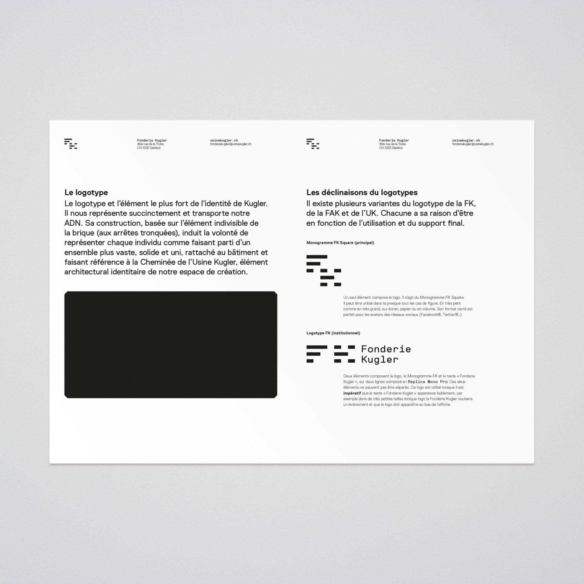
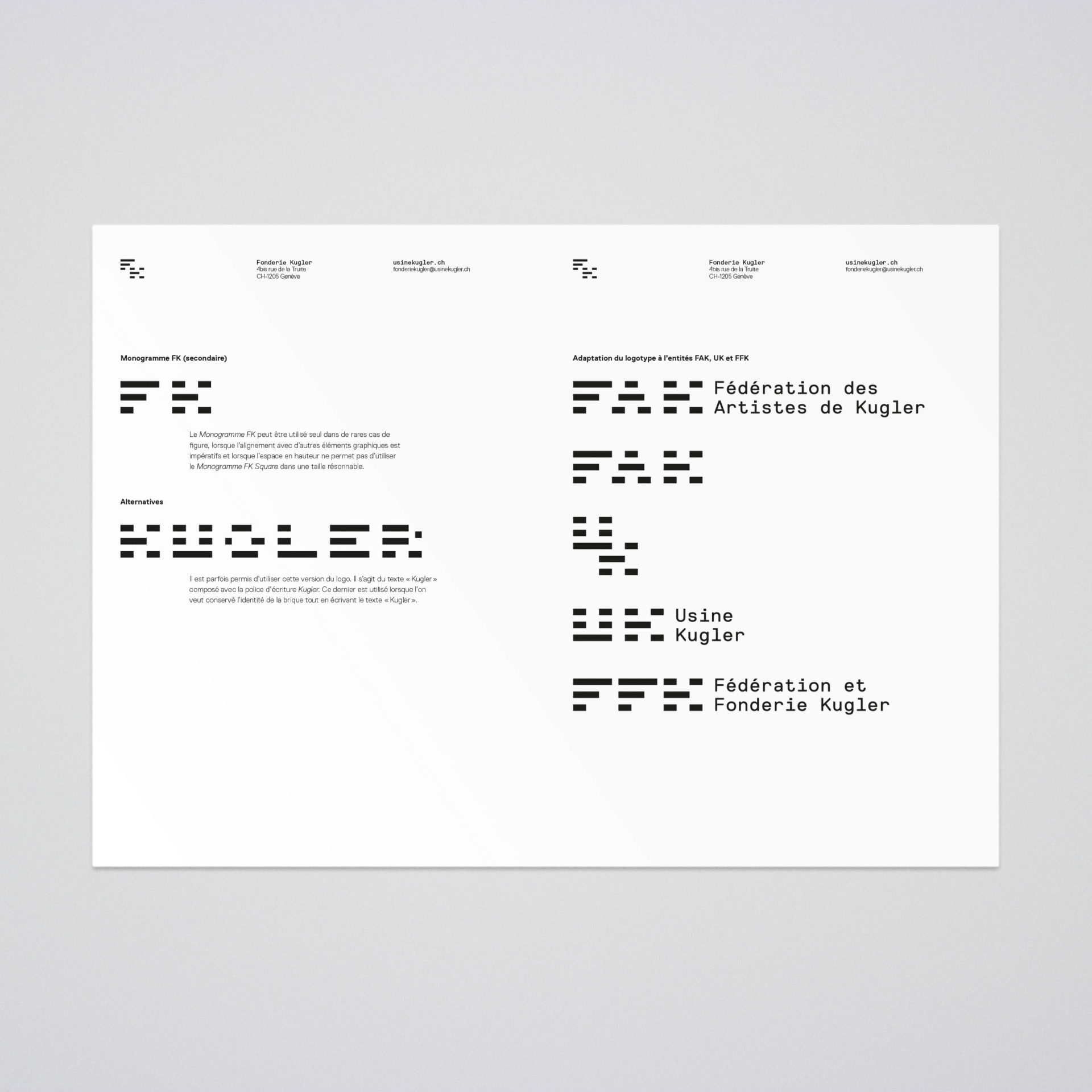
Right in the middle of the Kugler factory, sits an immense 19th-century brick chimney. The brick would become the primary constitutive element of the logotype. This fundamental unit will borrow structural elements from the typeface with which it will be coupled in order to create an harmony and complicity between the shapes, creating a consistent ensemble.

The brick
Logotypes

Primary logotype

Spacing

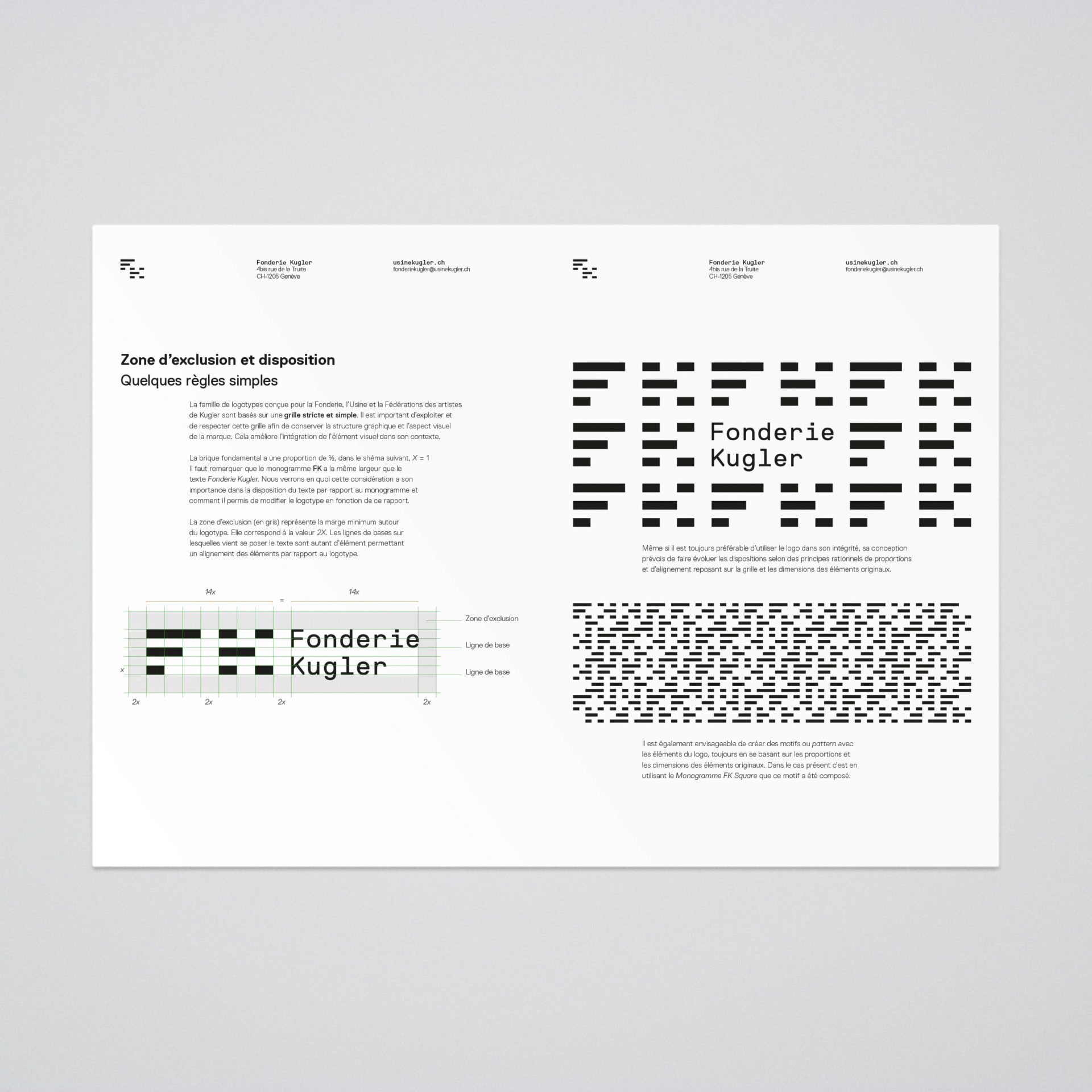
The monotype typeface and the monogram are constructed on a solid grid, allowing the creation of patterns, compositions, and structures.
The monogram
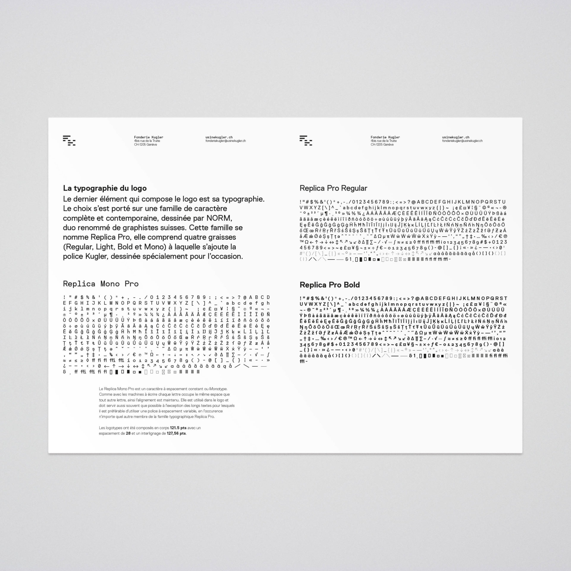
Typeface
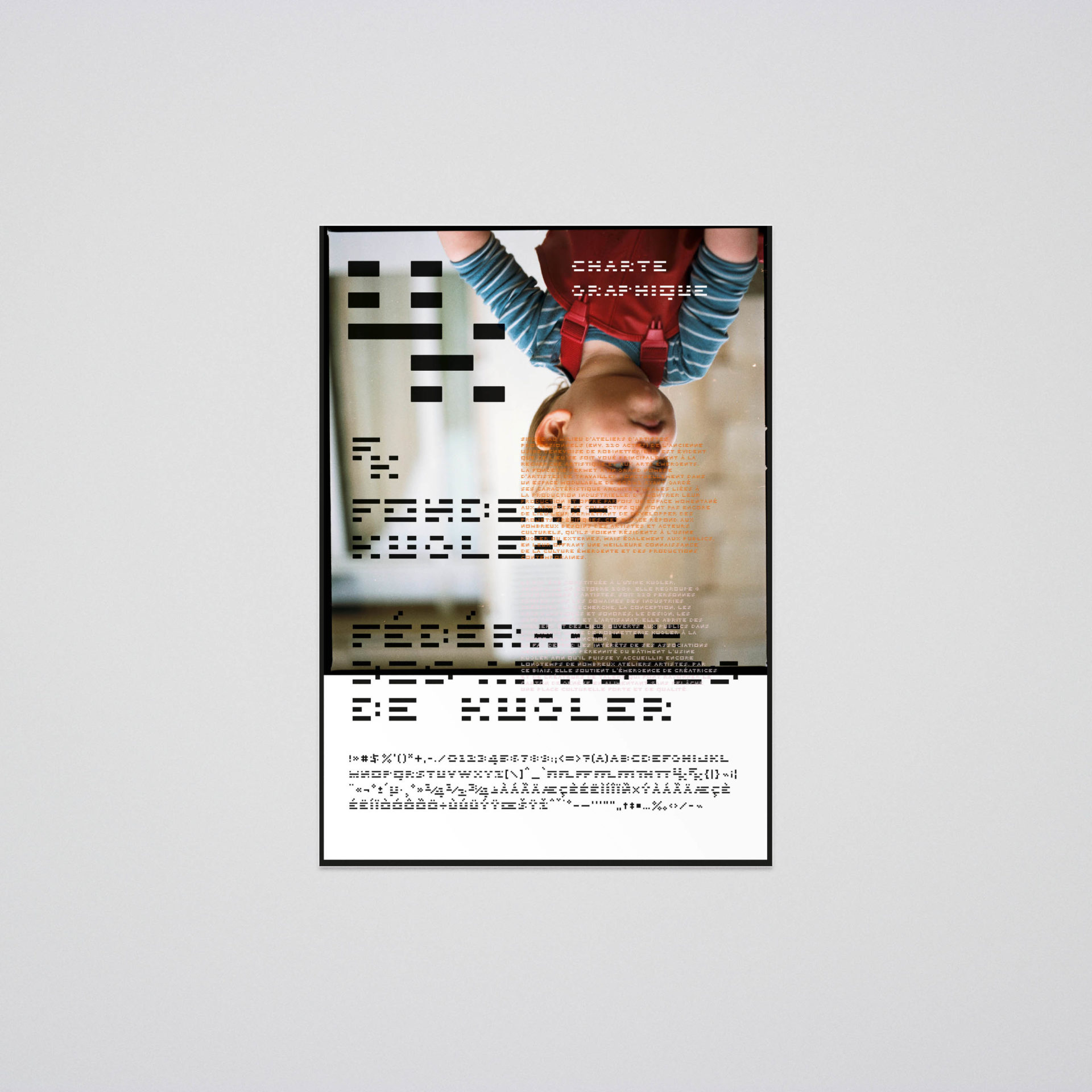
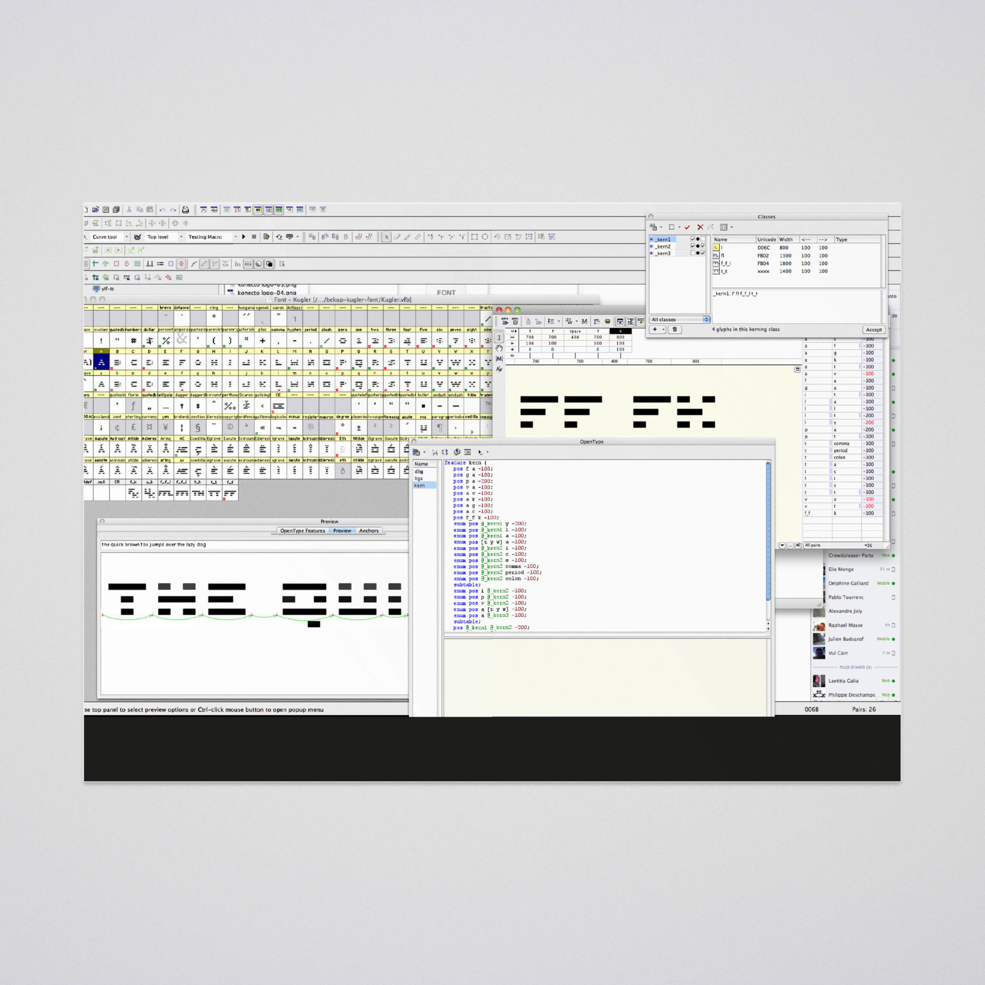
A bespoke typeface, based on the monogram, will help to design visual elements for posters, flyers, and digital communication, adding this powerful tool that is a typeface to the brand toolbox.

Character map

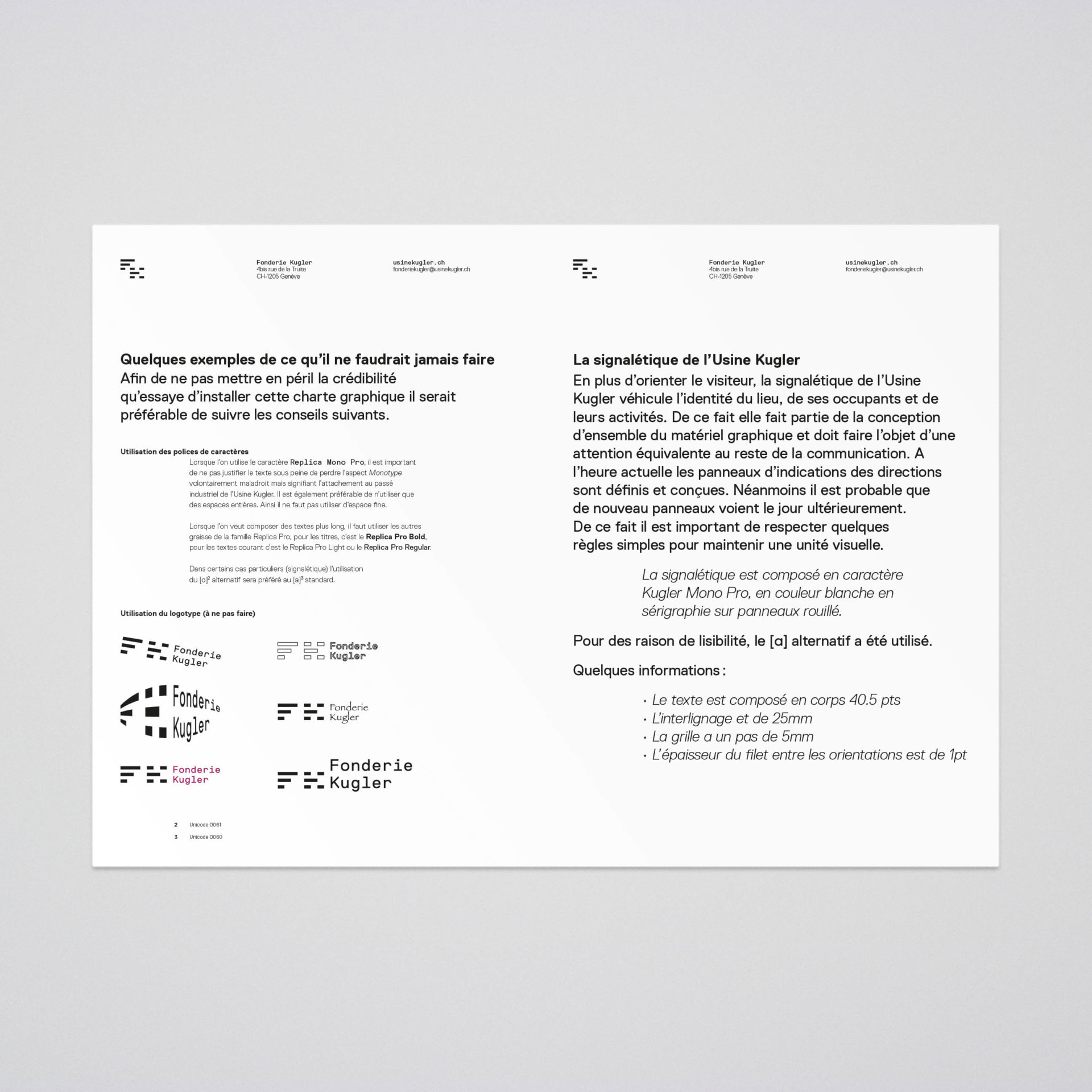
Signage

Signage
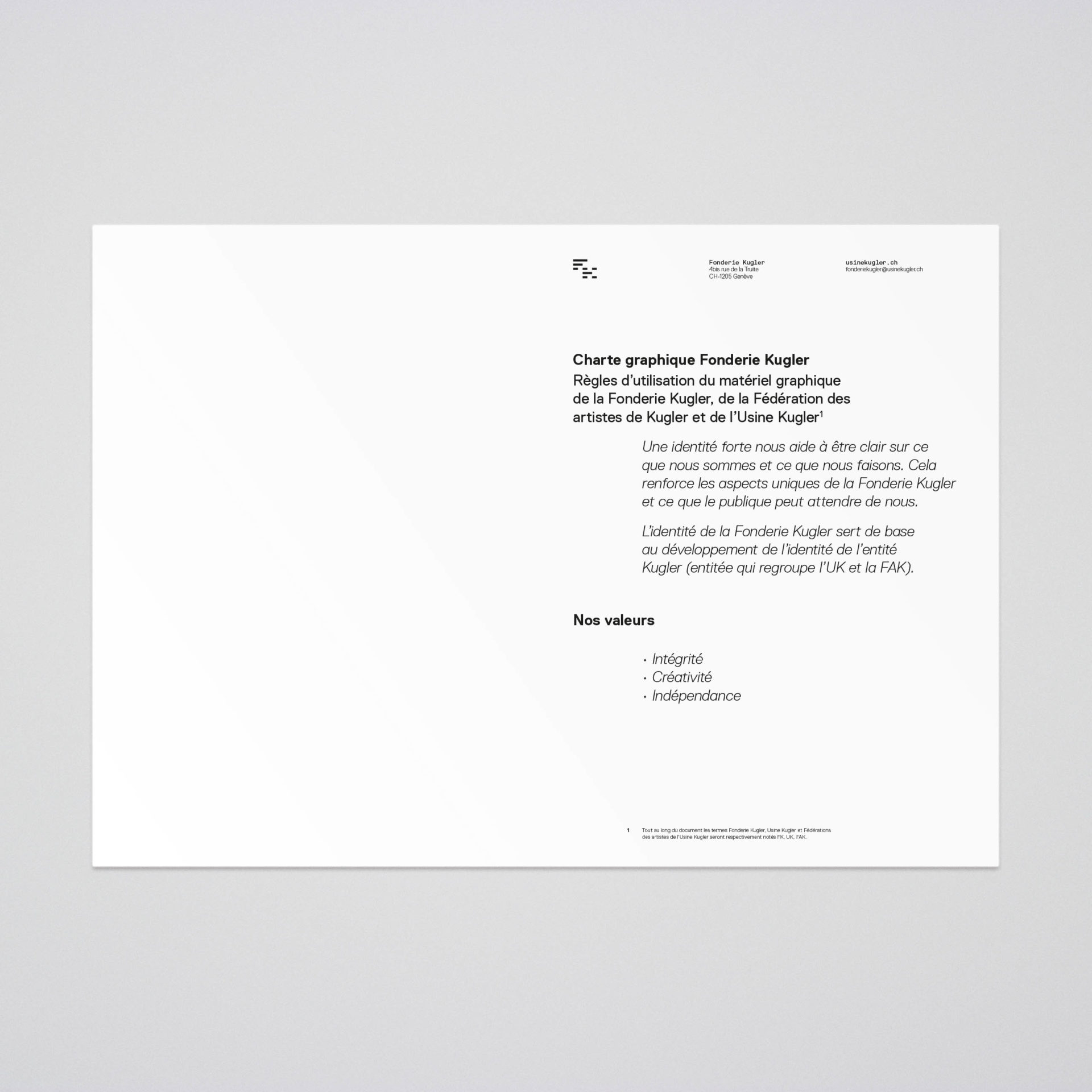






Guidelines


