Format & Dimensions
- Trim size: 197.5 × 270 mm
- Format: Portrait
- Total extent (English Full Report): 372 pages
- Binding: Section-sewn (thread sewing)
Typography
- Primary fonts:
- Akkurat
- GT Lyon
- Web fallbacks: Geist
Language Editions
- Languages: English, French, Arabic, Spanish, Russian, Chinese
- Pagination: Variable per language (affects spine width and cover adjustments)
- Layout considerations:
- Right-to-left adaptation for Arabic
- CJK typography handling (Chinese edition)
- Font system fully multilingual-ready
Additional Components
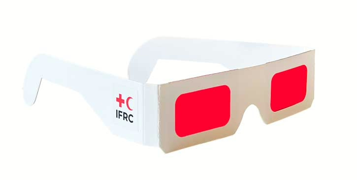
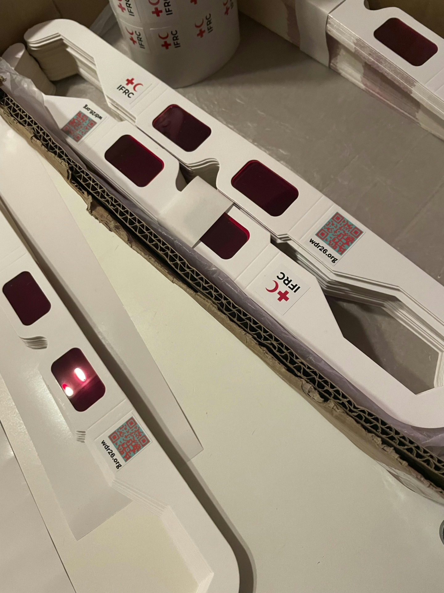
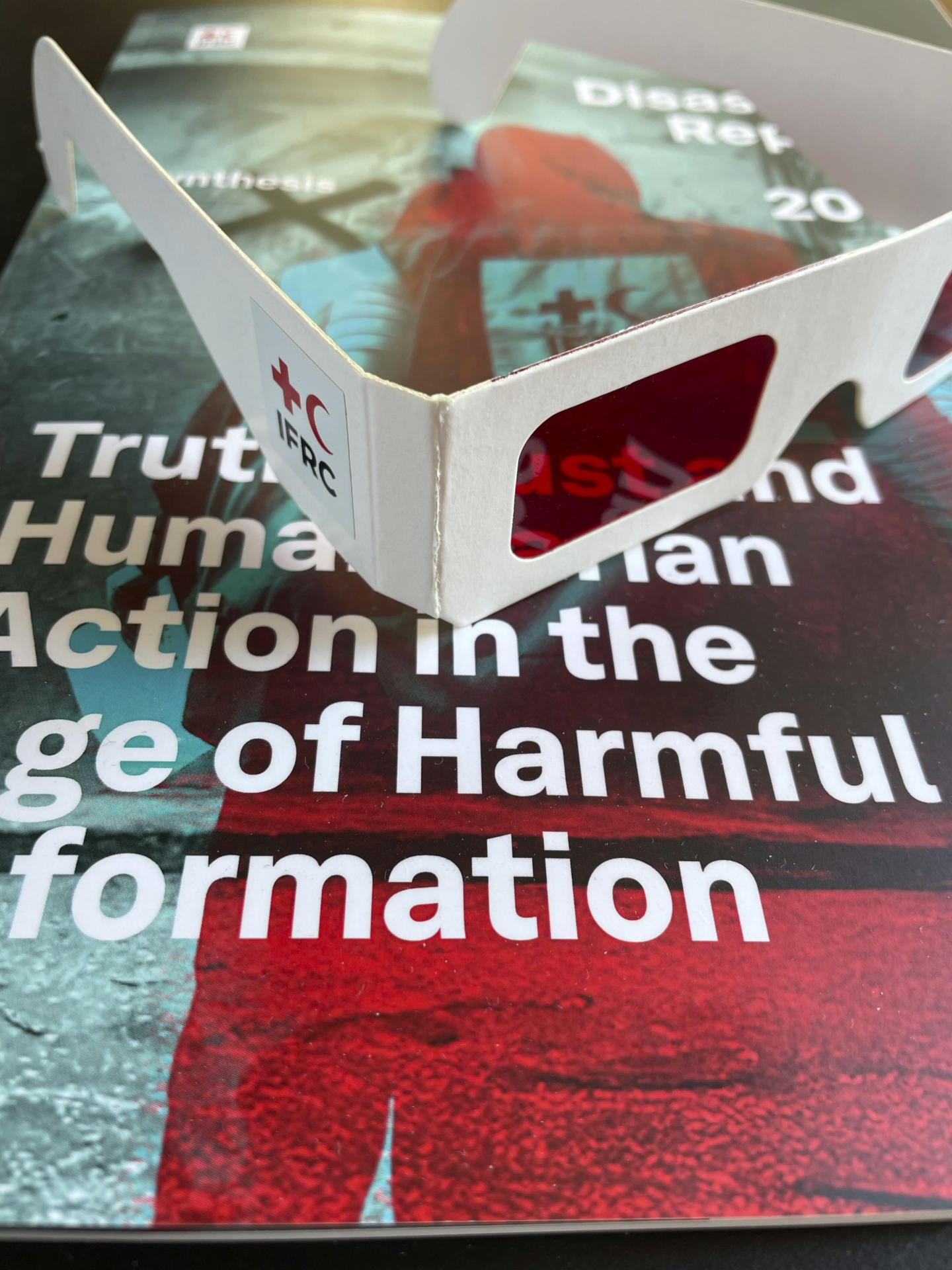
- Interactive element:
- Red filter glasses (used to reveal/hide layered imagery in print visuals)
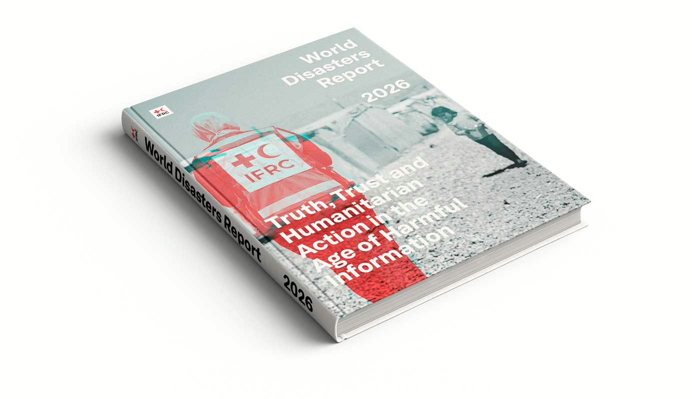
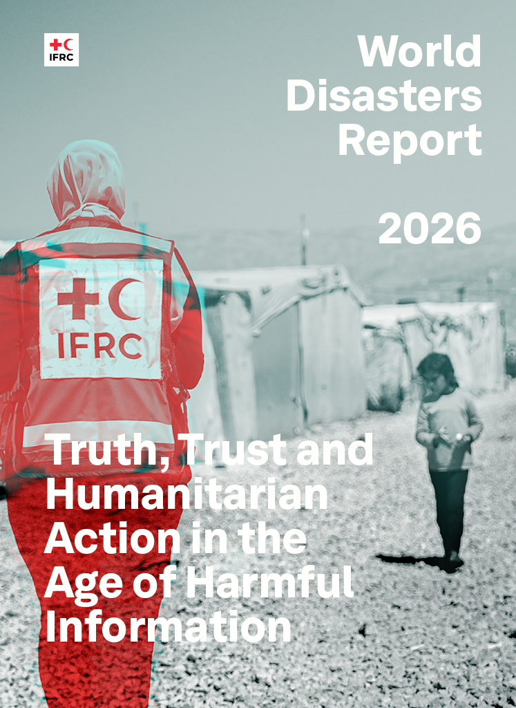
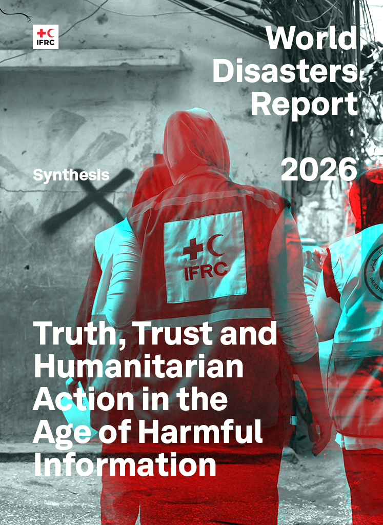
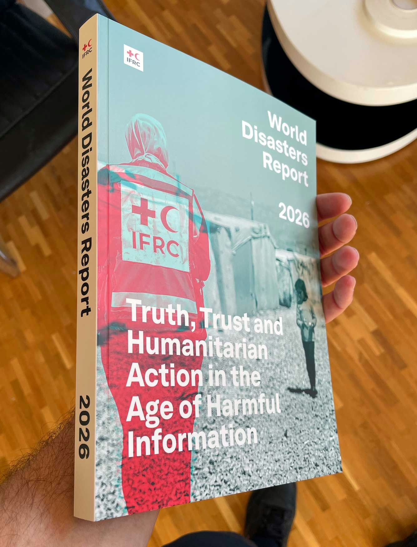
Truth, Trust, and Humanitarian Action in the Age of Harmful Information
There are reports, and then there are systems.
The World Disasters Report 2026 was never conceived as a publication alone. It became a multi-layered, multilingual, multi-format ecosystem designed to confront one of the most complex and intangible challenges facing humanitarian action today: harmful information.
What began as a question: how does information shape crisis outcomes? evolved into a year-long collaboration across disciplines, geographies, and institutions. The result is not only a report, but a new way of producing, translating, visualising, and engaging with humanitarian knowledge.
The Starting Point: A Different Kind of Crisis
Across crises, people are not only responding to events, they are responding to the information surrounding them.
This insight, drawn from the IFRC Solferino Academy’s Community Intelligence Network, became the backbone of the report. It reframed the humanitarian frontline as an informational one. Where trust, perception, and narrative directly influence whether aid is accepted, ignored, or rejected.
Design had to rise to that complexity.
Building the Foundation: Collective Intelligence at Scale
The process began upstream, with a deliberate effort to generate insight before designing outputs.
The global MDH (Mis-, Dis-, and Harmful Information) challenge activated practitioners, researchers, and innovators across the Red Cross Red Crescent network and beyond. It surfaced case studies, speculative tools, and grounded experiences—from misinformation during displacement to algorithmic amplification in fragile contexts.
This was not content collection. It was intelligence building.
From there, the editorial architecture took shape, led by a network of contributors, with direction from Shaun Hazeldine (Head of Solferino Academy), editorial coordination with Charlotte and close collaboration with experts including Heather Marie Leson and the Community Intelligence Network.
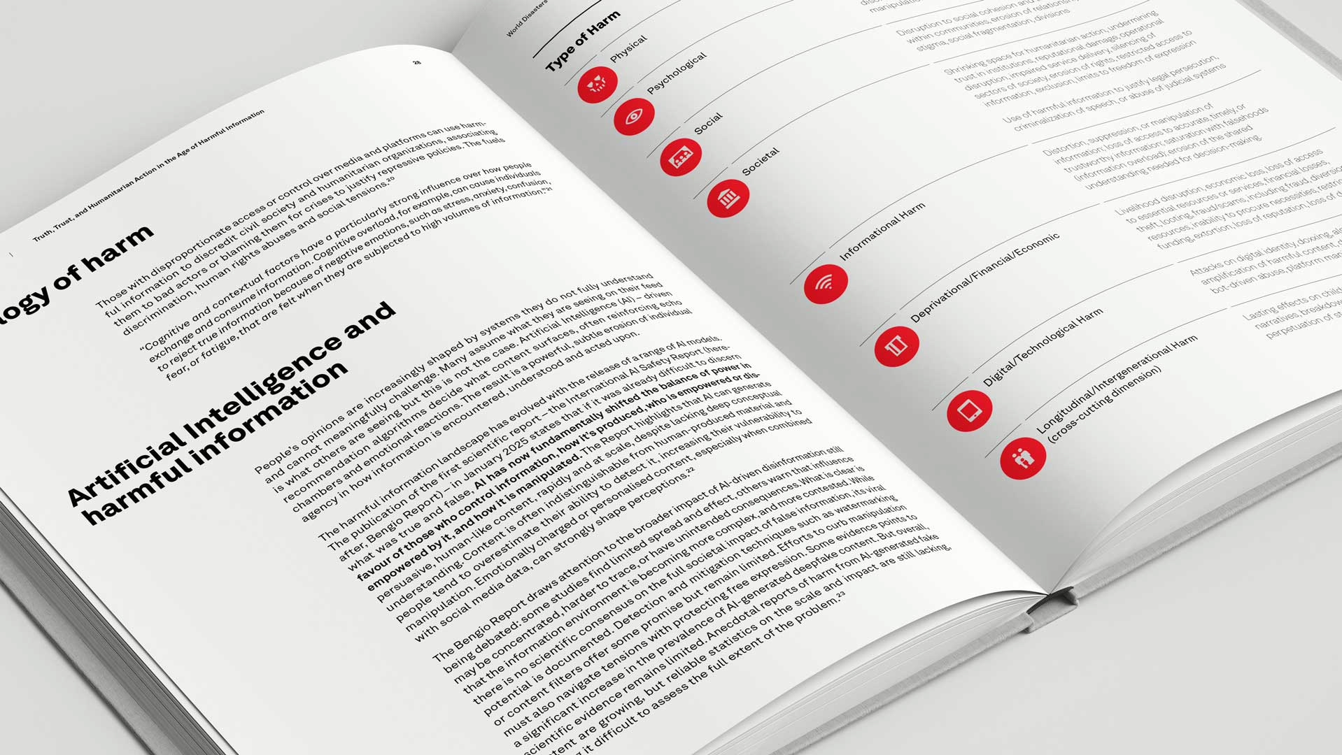
The ambition: move beyond describing the problem, and begin structuring a typology of harm.
IFRC World Disasters
Report 2026
Design as Translation: Making Complexity Legible
The report demanded more than clarity. It required precision without simplification.
A full visual system was developed to map harmful information across:
- Intensity of harm
- Scope and reach
- Intent (colour-coded)
- Type (shape-coded)
This matrix became both an analytical tool and a narrative device—bridging research, policy, and field realities.
IFRC World Disasters
Report Synthesis 2026
The design language avoided spectacle. No heroes, no dramatization. Instead: structured ambiguity, layered meaning, and space for interpretation.
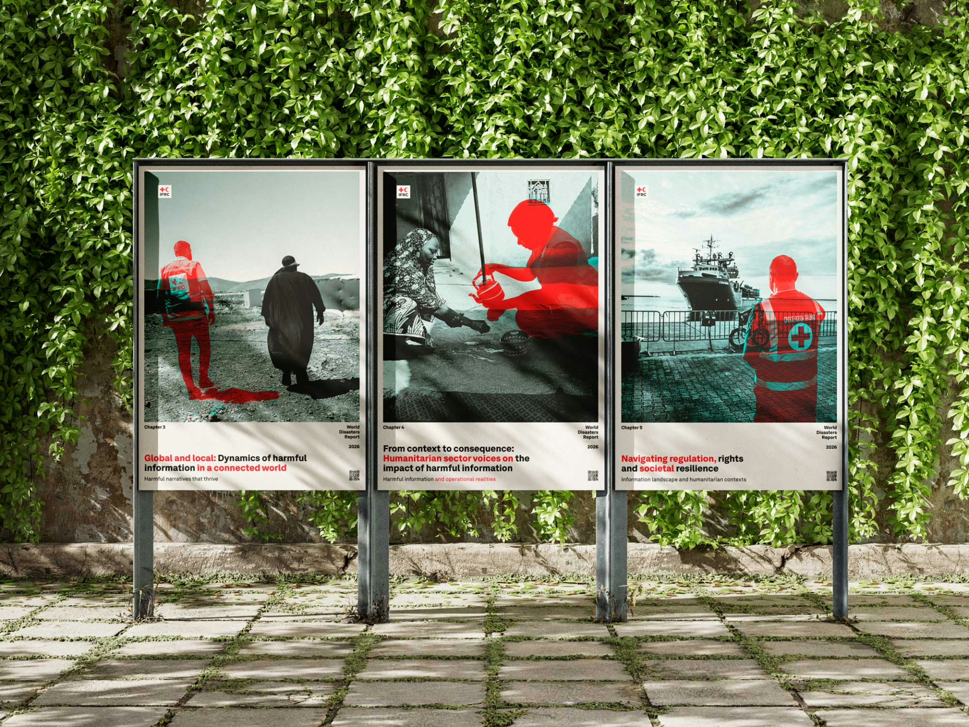
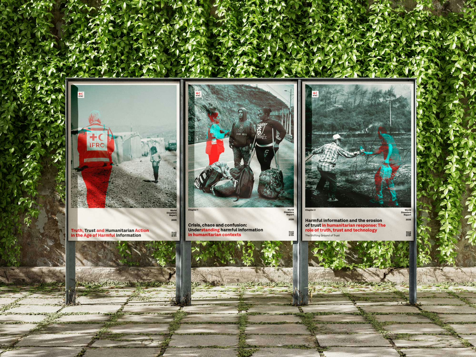
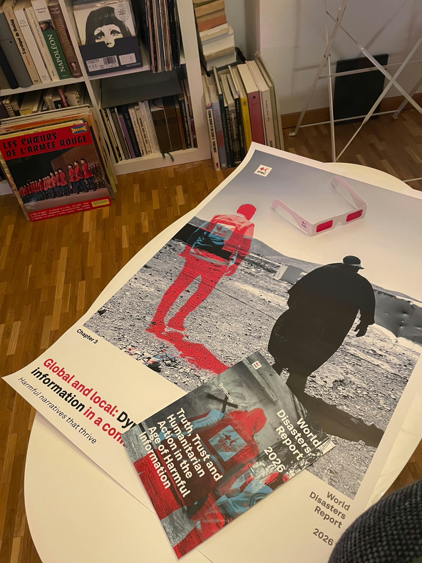
The central visual concept: dual-image compositions revealed through red filters, embodied the core tension of the report: what is visible, what is hidden, and what is misunderstood. Humanitarian actors appear and disappear depending on the lens, mirroring how trust and perception shape reality in crises.
This concept extended into physical artefacts: printed posters paired with red filter glasses, transforming passive viewing into active interpretation.
Engineering the Invisible: A Production System at Scale
Behind the scenes, the project required a complete rethinking of editorial production.
A custom InDesign → XML → Node.js pipeline was built to handle:
- 300+ pages across multiple report formats (Full Report, Synthesis, Annexes)
- Parallel production in multiple languages
- Structured tagging for digital reuse
- Automated merging of hyperlinks and endnotes across chapters
This system enabled:
- Consistency across languages
- Reusability of structured content
- Seamless transition from print to digital environments
Challenges were constant: style collisions, multilingual typography, endnote threading issues, XML inconsistencies. Each constraint pushed the system toward greater robustness. The result: a production workflow designed not just for this report, but for future iterations.
Rethinking Translation: From Bottleneck to Partnership
Translation was not treated as a final step, but as a core design challenge.
A hybrid workflow emerged:
- Structured exports and tagging
- Assisted translation workflows
- Reintegration into layout with minimal formatting loss
- Human refinement to preserve nuance, especially in sensitive contexts
Languages included English, French, Arabic, Spanish, Russian, and Chinese—each requiring not only linguistic adaptation, but layout, typographic, and cultural adjustments (including right-to-left systems).
This approach transformed translation from a bottleneck into a distributed collaboration layer.
From Report to Platform: The Playbook
The most radical shift came with the transition from static publication to dynamic interface.
In partnership with Monash University’s MOSAIC (Monash Students for AI with Communities), the World Disasters Report 2026 Playbook was developed as an interactive, multilingual web platform.
It allows users to:
- Navigate insights by theme, quote, or recommendation
- Engage with content through a mobile-first interface
- Explore harmful information through interactive filters
- Access content across six languages
It also introduced experimental elements:
- Two interactive games on misinformation
- Engagement filters that surface narratives rather than sections
This was not a companion website. It was a new format for humanitarian knowledge—designed for exploration, not just consumption.
From Object to Experience
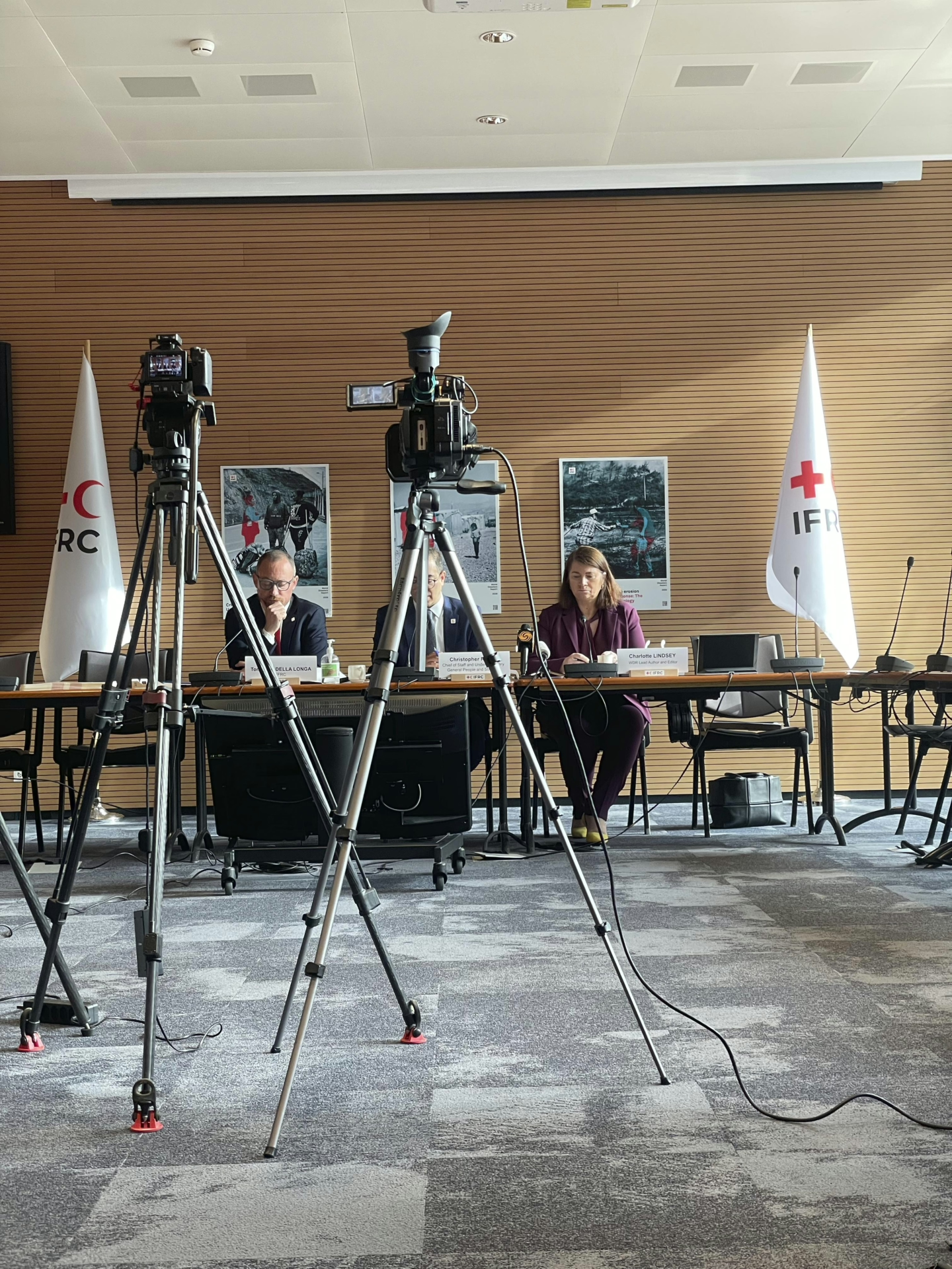
The report launched in Geneva, not as a presentation, but as a curated experience.
Posters, red filter glasses, physical books, and digital interfaces coexisted in the same space. The Secretary General, ambassadors, and partners engaged not only with the content, but with the mechanics of perception itself.
The installation asked a simple question: What do you see and what are you missing?
What This Project Represents
The World Disasters Report 2026 is the result of:
- A global intelligence effort grounded in real-world signals
- A design system that makes invisible dynamics visible
- A production pipeline engineered for scale and reuse
- A translation model built on collaboration, not outsourcing
- A digital platform that redefines how reports are accessed and used
It reflects what becomes possible when design is not treated as a layer—but as an integrative force across research, production, and engagement.
Credits (selected)
- Shaun Hazeldine — Head of Solferino Academy, Global Innovation Lead
- Charlotte Lindsey Curtet — Editorial Lead
- Heather Marie Leson — Digital Innovation Lead
- Community Intelligence Network — Global insight contributors
- Monash MOSAIC — Playbook development partner
Alongside dozens of authors, contributors, translators, designers, developers, and practitioners across the Red Cross Red Crescent Movement and beyond.


